When you first open the Holoscene site --it sounds like opening a present, and that's what a website should be-- it should be a well-tailored gift-- you're greeted with this 8-bit scene in the middle of the page, surrounded by white space.

What's cool about this is the delicate movement of the bird as it flies through the abundant space, making the space become real and active. Also, the "glittering"? of the colored lights in the skyscraper window. This also creates a sense of life, which is rarely seen in a website. The various levels of earth are a great way to incorporate a menu within the design itself. In fact, all it is is menu, which is awesome. The delicacy of the labels make it look modern and fresh, which takes over the 8-bit feeling, making that seem like a choice, not a limitation.
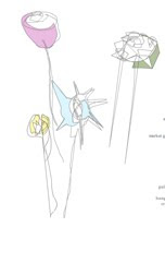
Now here's the true crown-- hit "menu" and look at those flowers. They move and change as though they're listening to some invisible music. It's a great incorporation of movement without taking over the scene. In fact, the delicacy does take over the scene, but it's so open that it keeps its boundary, leaving the viewer without feeling overwhelmed. What's lacking in this simplicity is a back button (OK, you can use your browser's) or another menu to explore the various pages in the site.

There's some nice animation near the bird in the "links" page, as well. It's powerful in speed, but extremely delicate. This delicacy and action brings in a definite feeling of life.
My favorite part, though, is the implied music through the flowers. They seem as though they're moving to music but, fortunately, there's no music involved. It's like, the site knows that we can't open it at work with sound, and not everyone has the same taste, so why appeal to universal appreciation of sound? Give it the implied sense of dance and let the user fill in the rest. Well done.


