OK, my post yesterday has been haunting me. Is it really OK that the splash page to The Holoscene website is this small image / island of Portland? Is it OK that they have so much negative space? Sure, it's fine. But what hit me every time I saw it was that I thought I was accidentally seeing a mobile site. That's true, and it can't be denied.
What could make it better?
They could command the space more by taking those moving flowers and placing them in some neat, intricate design, around the island of Portland. Or create a whole new design using the moving flowers element. I think that would make the site way stronger and more interesting. Perhaps that's the problem with the site-- there's too much wasted potential and not enough interest. Though way cool, it could be way better if they utilized the space and the design elements that are working... more.

Wednesday, June 29, 2011
Tuesday, June 28, 2011
The Holoscene: A Delicate Movement
My friends Ashley + Calvin just wed at The Holoscene on Saturday and, true to their world-class design style, they chose a venue whose design is well carried throughout their physical and virtual space. The physical-- well, creative, but let's check out the virtual.
When you first open the Holoscene site --it sounds like opening a present, and that's what a website should be-- it should be a well-tailored gift-- you're greeted with this 8-bit scene in the middle of the page, surrounded by white space.

What's cool about this is the delicate movement of the bird as it flies through the abundant space, making the space become real and active. Also, the "glittering"? of the colored lights in the skyscraper window. This also creates a sense of life, which is rarely seen in a website. The various levels of earth are a great way to incorporate a menu within the design itself. In fact, all it is is menu, which is awesome. The delicacy of the labels make it look modern and fresh, which takes over the 8-bit feeling, making that seem like a choice, not a limitation.
Now here's the true crown-- hit "menu" and look at those flowers. They move and change as though they're listening to some invisible music. It's a great incorporation of movement without taking over the scene. In fact, the delicacy does take over the scene, but it's so open that it keeps its boundary, leaving the viewer without feeling overwhelmed. What's lacking in this simplicity is a back button (OK, you can use your browser's) or another menu to explore the various pages in the site.
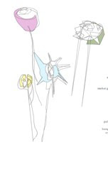
There's some nice animation near the bird in the "links" page, as well. It's powerful in speed, but extremely delicate. This delicacy and action brings in a definite feeling of life.
My favorite part, though, is the implied music through the flowers. They seem as though they're moving to music but, fortunately, there's no music involved. It's like, the site knows that we can't open it at work with sound, and not everyone has the same taste, so why appeal to universal appreciation of sound? Give it the implied sense of dance and let the user fill in the rest. Well done.
Wednesday, June 22, 2011
Line of Thought
Line.

Today I was thinking about lines and realized that they're everywhere, they're existent and nonexistent at the same time when they define the edges of objects, and they're anything but ennui. Ok, what prompted this line of thought? A design class where we were forced to draw various lines, and where we need to create works of lines for some major projects. And the professoressa (who left a job that advertised for her replacement in The New Yorker) asked us, "Do you find this activity boring?" to which we all/most raised our fingers a degree and shifted our eyes. But nay, says I, and fortunately these images that remind me that the simple line is a thing of beauty, and can be a part of beauty implied.
Check out The Art of Immersion by Frank Rose. The contour lines remind me of a melted record. And notice the illusory, perpendicular lines that form as you scroll the page up and down. Magnifique.

Or the image at the top of this post, a poster by Fabien Barral that incorporates color and star charts. Star charts are beautiful examples of poised and elegant lines.
The stars themselves also create lines, and that's another beauty of the line: even without being there, it's often implied and present. It's the strong and invisible line, like the vision of someone pointing. Today, while Nannying, I pointed to the sippy cup on the floor and said, "where is your milk?" hoping that he would see the invisible line that connected the tip of my finger to his cup. Instead, intrigued, he grabbed my finger with his full fist, then proceeded to shape his tiny hand like mine, index finger out, and to point at a few books on the shelves. He was totally absorbed in the curious quality of this motion, and I was absorbed with the ability to witness the formation of life lessons within an individual. The line was lost, but he'll connect the dots eventually.
http://www.graphic-exchange.com/home.html
Finally, check out these prints from Brent Wadden. Thanks, Design Sponge, for the inspiration.

Today I was thinking about lines and realized that they're everywhere, they're existent and nonexistent at the same time when they define the edges of objects, and they're anything but ennui. Ok, what prompted this line of thought? A design class where we were forced to draw various lines, and where we need to create works of lines for some major projects. And the professoressa (who left a job that advertised for her replacement in The New Yorker) asked us, "Do you find this activity boring?" to which we all/most raised our fingers a degree and shifted our eyes. But nay, says I, and fortunately these images that remind me that the simple line is a thing of beauty, and can be a part of beauty implied.
Check out The Art of Immersion by Frank Rose. The contour lines remind me of a melted record. And notice the illusory, perpendicular lines that form as you scroll the page up and down. Magnifique.
Or the image at the top of this post, a poster by Fabien Barral that incorporates color and star charts. Star charts are beautiful examples of poised and elegant lines.
The stars themselves also create lines, and that's another beauty of the line: even without being there, it's often implied and present. It's the strong and invisible line, like the vision of someone pointing. Today, while Nannying, I pointed to the sippy cup on the floor and said, "where is your milk?" hoping that he would see the invisible line that connected the tip of my finger to his cup. Instead, intrigued, he grabbed my finger with his full fist, then proceeded to shape his tiny hand like mine, index finger out, and to point at a few books on the shelves. He was totally absorbed in the curious quality of this motion, and I was absorbed with the ability to witness the formation of life lessons within an individual. The line was lost, but he'll connect the dots eventually.
http://www.graphic-exchange.com/home.html
Finally, check out these prints from Brent Wadden. Thanks, Design Sponge, for the inspiration.
Tuesday, June 21, 2011
Book Cover Design - Something Completely Different

I was walking along the bountiful bookshelves of Powell's last night and checking out the Science Fiction section, a bewildering place because I know nothing about it except for the fact that Mark likes it; so I often venture into the dragon-filled, paperback world and find myself dumbfounded. What to get? Does he like Knights and Dragons science fiction, Martian Fiction, Wizards Fiction, or Futuristic lore? (Does that even make sense, anachronistically?) I don't know what he likes, I don't know what authors are good, and, quite frankly, all of the books look the same, which is so confusing.
It's true. They all look like romance novels with men in action poses, riding dragons or horses or space ships. That is, they all did, until Simon Morden revolutionized the Science Fiction book cover, shaking it to its core. I mean, just look at his geometric covers and then the goulash of books around them. They stand out. They "speak volumes!", they're different. They're all optical illusions, which is in perfect theme with the content of his work.
Bravo, Orbit. It'd be cool to know who the designer behind the covers is. Do you know? Do you have a favorite book cover?
Wednesday, June 1, 2011
Your DIY Spanish Style Bedroom


OK, you want a DIY Spanish look for your bedroom, you want to give only a handful of dollars, and you want it in a weekend. Here's a simple way to create your bedroom's new look:
You'll Need:
Paint: Primer & a nice, BOLD color
Fabric with an intricate, bold pattern on it
Fabric for drapes (or new drapes)
Objects from Nature
Frames
Spray Paint
~~~~~ the first step ~~~~~
OK, the first thing you can to do transform your bedroom into a Spanish Manor is to remove your furniture and paint the walls a BOLD color. Painting the room is the cheapest way to have a huge effect. A deep and lavish red is nice and dramatic, while an eggshell blue or a spring green all have personality to them, which is what you want. If painting the entire room is too much, consider doing just a wall. If you can't get enough paint, consider doing the ceiling a complimentary color. Also think about the size of your room: darker colors will give it a smaller, cozy feeling while lighter colors will open it up. If you live in a dark area, then lighter (yet still saturated) colors might be the way to go.
~~~~~ the second step ~~~~~
OK, now think about what you want to bring back into your room. Does your furniture match your new look, or is it more of a Victorian or even teenage hue? This is the time to select what you keep, and what you find another home for (your friends, curb, and even your basement/attic will be happy to house what you don't need).
What should you keep? Woods. Natural elements. Things in bold color. Don't bring too much back-- it's nice to live in an open, airy environment, especially if this Spanish Manor is anywhere near the Mediterranean in your imagination.
~~~~~ the third step ~~~~~
Cheap, DIY Wall Art.
Here's where your fabric and frames come in. Purchase some great fabric with strong patterns and colors, or choose a nice white-on-white pattern, and frame it with old frames. You can pick up your frames from garage sales and thrift stores. To create a complete look, remove the glass from the frames and spray paint them a complimentary color to your new walls. When dry, replace the glass, add the fabric, and hang. Instant art, few dollars, big effect.
~~~~~ the fourth step ~~~~~
Drapes. The longer the drapes, the more dramatic the feel, so go straight to the floor. You can either purchase new drapes, or buy some fabric and make your own. Making your own is way cheaper (depending on the fabric), way more DIY, and is the best way to get the perfect length.
~~~~~ the fifth step ~~~~~
Engage your Antique Finding Skillz and look out at garage sales and thrift stores for any accessories that fit your new look. Those could be colorful ceramics, Virgin Mary statues, crosses, and other beautiful items. You don't need too much: a few pieces make a strong statement while several pieces create a crowd.
~~~~~ the sixth step ~~~~~
Lay back and enjoy! And if your friends helped you create your piece di resistance, some tapas & beer is an excellent way to pay them back (just a suggestion).
Want more inspiration?
Spanish Homes Photography
Frida Kahlo
Look up Spanish Style Decor on Google
Do you have any suggestions for creating the perfect DIY Spanish Style room?
Subscribe to:
Posts (Atom)