Wednesday, November 2, 2011

I Want It Now


OK, so how did MidNite not know that their ad is highly suggestive?

She's wearing lingerie and giving this sexy, three-quarter profile and saying "I need it in the middle of the night." Don't miss the slightly parted lips.

And then there's this guy with his hand on her arm, in bed (and that ring is visible so they can show this add in all 52 states), saying "I want it now."

Really?

And no one in the board room said, "um, that looks just a little risque"... not that I'm complaining, but it definitely wasn't intentional. Come on, guys!

A better ad: What if they had a bird's eye view of the bed and each person, on either side of the bed, obviously can't sleep. Then they have thought bubbles... Oh! OK, one person is sleeping, and the other person's thought bubble says, "I wish I had MidNite" or, the ad is of someone turning off a lamp, just about to tuck into bed, and they have a smile on their face. The caption below them reads "Thank you, MidNite."

Or... any idears?

Thursday, October 13, 2011

Galerie Richard - Linda Besemer


OOOH, check out these colorful, plastic pieces by Linda Besemer. I sure would like one on my walls.

Tuesday, September 27, 2011


This promotion is awesome. I found the sparkling gem in downtown Portland, in a honeycomb building filled with artist studios that house designers, developers, and a few incredible artists.

Just take a look at it. Wait, don’t read the copy just yet. Let the image take over. I love the girl shouting, the colors coming out of her face, her hand, and the colors on her head, adding some dimension. Why do I love it? Maybe because of the powerful expression that everyone understands -- hey! listen! news! -- and because of the strong diagonal lines of color, which augment her message like a can of whoop ass. Also, it’s a night of dialogue, so the visual is perfect in that it expresses yelling, shouting, speech.

And while this little flier is so extremely awesome, there are some small and confusing quirks.

First, the design really has nothing to do with any of the ideas brought up in the first set of copy. There’s no visual indicato about America, economics, “the great cultural shift”, veganism, etc. Is there a way that the design could still carry the simple message of speech while bringing in any of these elements?

And the copy within the colors. First: totally differing fonts, and a lot of ‘em. Someone once told me a million years ago to not mix too many fonts. And I’ve always adhered to that blindly... and I still agree, in this case. Sorry dudes.

You have this old western font and the totally askew “Sat. Aug 27th” font. If they could have made the SAt AUG 27th” font in line with the diagonals, it wouldn’t be so jolting. But, it’s definitely eye catching.

SpeakUp! being a whole new font... are they saying to speak up, or is that a name of a group, or what? No space between Speak and Up, so I assume it’s a group and that’s why they gave it a font of its own?

The “no one turned away / space limited” copy is somewhat hilarious. OK.... Space IS limited, but no one’s turned away. So don’t hurry now!

Maybe having “Hawthorne Hostel” at the top of the page, with the other copy in all new places...

But despite any design element quandaries, it’s so good that it inspired me to create my own personal business cards, separate from my photography, in a similar fashion. And M walked into my office and said, “Whoa” when he looked at it. Just what they wanted.

Any suggestions for improvement, or enjoy as-is?

- P -

Monday, August 15, 2011

Love to Write


I just thought, "I would love to be writing in my blog right now..." and, instead of doing something else more 'productive', this is it. This is productive. It's about aligning your life.

Today I listened to Anything You Want, 40 Lessons From a New Kind of Entrepreneur, by Derek Sivers, who created CD Baby. The books is packed with amazing advice, like the Hell Yeah! factor: don't do anything unless it makes you go, "Hell, yeah!" That's your indication that whatever you're doing is worth it.

He also reminded me that you should do something to BE something, or someone. As in, don't do it for the result, do it for the incarnation. Like, I am a writer. So I write. I write because I am a writer and, to be a writer, I must write. For some reason, this focus on being, and on doing to be, provides the space and freedom to do it without any expectations. Just doing it to be... lets you do it.

I'm driving down to CA on a long road, and have stopped in Ashland for a little bit of beauty on this long, dull trip that I know so well. I was going to cross over to Highway 101-- and there's my lesson. That would have been a Hell, Yeah! moment, whereas this ten-hour drive down I-5 is a watery "done it". My focus right now is the ocean. I need to get back to it.

~ ~ ~ ~ ~ ~ P ~ ~ ~ ~ ~ ~

Thursday, August 11, 2011

Vintage Labels from the Oregon Fruit Company


Oregon Fruit Company, from Salem, Oregon, has these amazing illustrated labels on their fruit.

The vintage look on them reflects their vintage history-- they were started in 1935 and are still running in Salem, Oregon. It also adds power and believability in the freshness and quality of their fruit. It's amazing that hand-drawn can translate to higher quality in the mind of the viewer, but here's how they do it:

There are rich colors, and with the darks and lights, you can really control the viewer's focus. The black makes the reds in those cherries pop. The red also has more power and strength, which translates to hearty and good quality cherries. It's somewhat reminiscent of the dutch painter Clara Peeters:


Also, the hand-illustrated labels are different from all of the other fruit labels, which have photographs of the fruit on them. The photographs can look kind of gross, the fruit is all shiny, and the viewer knows what they're getting right away. Shiny bits of fruit. With these labels, there's a weighty power and still a surprise element. Though it looks really good, the viewer only has this strong anticipation. The fruit is still to be unwrapped, as it were, and revealed, like a gift.

There's also a pride element to the name, and the prominence of "Oregon". It seems like high quality, Oregon goods. People identify with it, with the beauty and strength, and want to be a part of the label. WE are OREGON FRUITS.

Ha.


Wednesday, July 27, 2011

Sutro Bleu

I can't stop thinking about the words Sutro Bleu. Sutro Bleu is an art movement that exists between two people, one person whose life has branched into other areas, and whose life only crossed with mine in the silhouette of a boyfriend, who I dated for a month or more. His roommate Victor and I met up in San Francisco when I was there for work and he was passing through, and we went to the abandoned and ocean-washed Sutro Baths.

And, over dinner and after viewing the ocean, we created an art movement, Sutro Bleu. I recalled it the other day with friends, while we were talking about something to do with their lives, and Sutro Bleu came to me. And it was totally, and utterly, mine. It's mine, and it's originally and inspirationally mine. It felt like some identity, some value, something solid and there. And, strangely, it had been gone, muffled under the waves of life, for almost five years. Why did it just come up, suddenly, and why is it now, persistently, in my thoughts? Sutro Bleu, Sutro Bleu, what are you saying?

If I take it like a dream: an art movement, a character named Victor who, with me, created something originally ours, something that ties in with who I am; a person who grew up near the oceans of SF, with water in her back yard. And with France, and the beauty of France, the fun of European Travel, and who we want to be.

I think that'll be my new design name. Sutro Bleu. Should it be my blog name, too?

- P

Monday, July 25, 2011

Two-Toned & Monochrome

.... From City Dog's Single Color to the Two-Toned Love of Isaac Hers.

& How you Can keep Monochromatic Interesting
& How to Create the look & feel of Expense & Elegance with a two-toned look

Lead down the rabbit hole of Monochromatic sites, I came upon 
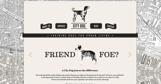
City Dog, which plays the Monochrome like a winning hand. What makes this site successful and not boring is the visual subject matter-- it has a beautiful (are maps almost always beautiful?) grey map as the background pattern. The map has various shades / values of grey, some darker and some lighter, so it employs not only interest in its pattern, but in its tone. The fact that it's still all one color keeps the visual in-tact and together.

It also employs visual candy like vintage images, a rotating carousel with great writing ("Boot or Bone?" "Friend or Foe?" "Litter or Lunch?") and those snappy vintage images, and an intriguing pointed dog logo (the vintage style is great, the pointing dog is as serious and playful as the business, and by pointing it's saying, "Found It", with "it" being, of course, the business).


Then we move to 
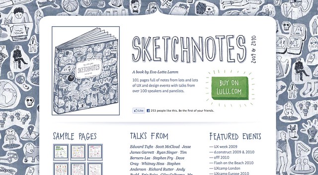
Sketchnotes, which employs some of the same basic interest points and some sneaky hidden color. Instead of all grey, it's a grey blue, which adds a little more interest for the mind. It also has a varied and playful background pattern-- it's covered with little comics, each one surrounded by white, so it's spotted with fun and playful images. They make the mind wander over the page to read them, which is a great way to entertain the viewer / user and to lead them over the page Without Their Realizing It. Mind control? Well, yes. Some of the hand-drawn text also adds happy variety. But the hidden color! Scroll over the Buy On Lulu.Com and Voila! Hidden Green and a Starburst! Eva Lotta Lam can't be constrained by blue and adds the Easter Egg green throughout. Yes, OK, it's just colored links and a starburst on her Buy button, but the playfulness is fabulous.


And where does this rabbit hole end?

Surprisingly, it ends with a very sheer simplicity and elegance, one that I didn't expect. But when I ran across it, I knew this was the reason why I'd followed the path.

Take a gentle monochromatic piece (calling black and white monochromatic) and add a sheer, simple flesh tone, and you get the Coco Chanel look, or the... Converse Vogue look, or just that striking elegance of all-grown-up and partying at fancy places. Look at Isaac Hers. Her header image is of a delicate grey zigzag pattern. The spikes of the zigzags give it some power, like teeth, but the thin lines keep it elegant and gentle. And then, add the sheer, flesh-colored box to the center and it looks like a perfume box, or a clothing box, or a label, and it definitely looks expensive.


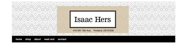
So that's how to create the expensive and luxury look. Use a monochromatic pattern and add a very sheer and clean/contained shape over it, preferably to encase the name.

And if you're going Monochromatic, remember the element of play. Use variety in your pattern, text, and entertainment (carousel, witty language) or even employ an Easter Egg of color, and voila-- successful site.

Have a fabulously designed day!