Wednesday, November 2, 2011

I Want It Now


OK, so how did MidNite not know that their ad is highly suggestive?

She's wearing lingerie and giving this sexy, three-quarter profile and saying "I need it in the middle of the night." Don't miss the slightly parted lips.

And then there's this guy with his hand on her arm, in bed (and that ring is visible so they can show this add in all 52 states), saying "I want it now."

Really?

And no one in the board room said, "um, that looks just a little risque"... not that I'm complaining, but it definitely wasn't intentional. Come on, guys!

A better ad: What if they had a bird's eye view of the bed and each person, on either side of the bed, obviously can't sleep. Then they have thought bubbles... Oh! OK, one person is sleeping, and the other person's thought bubble says, "I wish I had MidNite" or, the ad is of someone turning off a lamp, just about to tuck into bed, and they have a smile on their face. The caption below them reads "Thank you, MidNite."

Or... any idears?

Thursday, October 13, 2011

Galerie Richard - Linda Besemer


OOOH, check out these colorful, plastic pieces by Linda Besemer. I sure would like one on my walls.

Tuesday, September 27, 2011


This promotion is awesome. I found the sparkling gem in downtown Portland, in a honeycomb building filled with artist studios that house designers, developers, and a few incredible artists.

Just take a look at it. Wait, don’t read the copy just yet. Let the image take over. I love the girl shouting, the colors coming out of her face, her hand, and the colors on her head, adding some dimension. Why do I love it? Maybe because of the powerful expression that everyone understands -- hey! listen! news! -- and because of the strong diagonal lines of color, which augment her message like a can of whoop ass. Also, it’s a night of dialogue, so the visual is perfect in that it expresses yelling, shouting, speech.

And while this little flier is so extremely awesome, there are some small and confusing quirks.

First, the design really has nothing to do with any of the ideas brought up in the first set of copy. There’s no visual indicato about America, economics, “the great cultural shift”, veganism, etc. Is there a way that the design could still carry the simple message of speech while bringing in any of these elements?

And the copy within the colors. First: totally differing fonts, and a lot of ‘em. Someone once told me a million years ago to not mix too many fonts. And I’ve always adhered to that blindly... and I still agree, in this case. Sorry dudes.

You have this old western font and the totally askew “Sat. Aug 27th” font. If they could have made the SAt AUG 27th” font in line with the diagonals, it wouldn’t be so jolting. But, it’s definitely eye catching.

SpeakUp! being a whole new font... are they saying to speak up, or is that a name of a group, or what? No space between Speak and Up, so I assume it’s a group and that’s why they gave it a font of its own?

The “no one turned away / space limited” copy is somewhat hilarious. OK.... Space IS limited, but no one’s turned away. So don’t hurry now!

Maybe having “Hawthorne Hostel” at the top of the page, with the other copy in all new places...

But despite any design element quandaries, it’s so good that it inspired me to create my own personal business cards, separate from my photography, in a similar fashion. And M walked into my office and said, “Whoa” when he looked at it. Just what they wanted.

Any suggestions for improvement, or enjoy as-is?

- P -

Monday, August 15, 2011

Love to Write


I just thought, "I would love to be writing in my blog right now..." and, instead of doing something else more 'productive', this is it. This is productive. It's about aligning your life.

Today I listened to Anything You Want, 40 Lessons From a New Kind of Entrepreneur, by Derek Sivers, who created CD Baby. The books is packed with amazing advice, like the Hell Yeah! factor: don't do anything unless it makes you go, "Hell, yeah!" That's your indication that whatever you're doing is worth it.

He also reminded me that you should do something to BE something, or someone. As in, don't do it for the result, do it for the incarnation. Like, I am a writer. So I write. I write because I am a writer and, to be a writer, I must write. For some reason, this focus on being, and on doing to be, provides the space and freedom to do it without any expectations. Just doing it to be... lets you do it.

I'm driving down to CA on a long road, and have stopped in Ashland for a little bit of beauty on this long, dull trip that I know so well. I was going to cross over to Highway 101-- and there's my lesson. That would have been a Hell, Yeah! moment, whereas this ten-hour drive down I-5 is a watery "done it". My focus right now is the ocean. I need to get back to it.

~ ~ ~ ~ ~ ~ P ~ ~ ~ ~ ~ ~

Thursday, August 11, 2011

Vintage Labels from the Oregon Fruit Company


Oregon Fruit Company, from Salem, Oregon, has these amazing illustrated labels on their fruit.

The vintage look on them reflects their vintage history-- they were started in 1935 and are still running in Salem, Oregon. It also adds power and believability in the freshness and quality of their fruit. It's amazing that hand-drawn can translate to higher quality in the mind of the viewer, but here's how they do it:

There are rich colors, and with the darks and lights, you can really control the viewer's focus. The black makes the reds in those cherries pop. The red also has more power and strength, which translates to hearty and good quality cherries. It's somewhat reminiscent of the dutch painter Clara Peeters:


Also, the hand-illustrated labels are different from all of the other fruit labels, which have photographs of the fruit on them. The photographs can look kind of gross, the fruit is all shiny, and the viewer knows what they're getting right away. Shiny bits of fruit. With these labels, there's a weighty power and still a surprise element. Though it looks really good, the viewer only has this strong anticipation. The fruit is still to be unwrapped, as it were, and revealed, like a gift.

There's also a pride element to the name, and the prominence of "Oregon". It seems like high quality, Oregon goods. People identify with it, with the beauty and strength, and want to be a part of the label. WE are OREGON FRUITS.

Ha.


Wednesday, July 27, 2011

Sutro Bleu

I can't stop thinking about the words Sutro Bleu. Sutro Bleu is an art movement that exists between two people, one person whose life has branched into other areas, and whose life only crossed with mine in the silhouette of a boyfriend, who I dated for a month or more. His roommate Victor and I met up in San Francisco when I was there for work and he was passing through, and we went to the abandoned and ocean-washed Sutro Baths.

And, over dinner and after viewing the ocean, we created an art movement, Sutro Bleu. I recalled it the other day with friends, while we were talking about something to do with their lives, and Sutro Bleu came to me. And it was totally, and utterly, mine. It's mine, and it's originally and inspirationally mine. It felt like some identity, some value, something solid and there. And, strangely, it had been gone, muffled under the waves of life, for almost five years. Why did it just come up, suddenly, and why is it now, persistently, in my thoughts? Sutro Bleu, Sutro Bleu, what are you saying?

If I take it like a dream: an art movement, a character named Victor who, with me, created something originally ours, something that ties in with who I am; a person who grew up near the oceans of SF, with water in her back yard. And with France, and the beauty of France, the fun of European Travel, and who we want to be.

I think that'll be my new design name. Sutro Bleu. Should it be my blog name, too?

- P

Monday, July 25, 2011

Two-Toned & Monochrome

.... From City Dog's Single Color to the Two-Toned Love of Isaac Hers.

& How you Can keep Monochromatic Interesting
& How to Create the look & feel of Expense & Elegance with a two-toned look

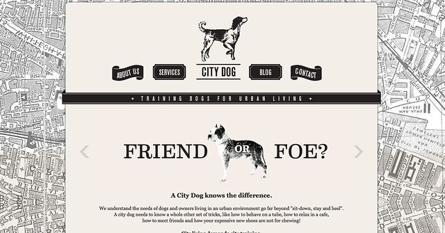
Lead down the rabbit hole of Monochromatic sites, I came upon City Dog, which plays the Monochrome like a winning hand. What makes this site successful and not boring is the visual subject matter-- it has a beautiful (are maps almost always beautiful?) grey map as the background pattern. The map has various shades / values of grey, some darker and some lighter, so it employs not only interest in its pattern, but in its tone. The fact that it's still all one color keeps the visual in-tact and together.

It also employs visual candy like vintage images, a rotating carousel with great writing ("Boot or Bone?" "Friend or Foe?" "Litter or Lunch?") and those snappy vintage images, and an intriguing pointed dog logo (the vintage style is great, the pointing dog is as serious and playful as the business, and by pointing it's saying, "Found It", with "it" being, of course, the business).


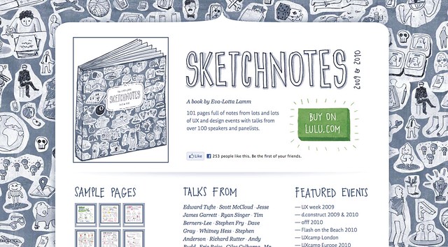
Then we move to Sketchnotes, which employs some of the same basic interest points and some sneaky hidden color. Instead of all grey, it's a grey blue, which adds a little more interest for the mind. It also has a varied and playful background pattern-- it's covered with little comics, each one surrounded by white, so it's spotted with fun and playful images. They make the mind wander over the page to read them, which is a great way to entertain the viewer / user and to lead them over the page Without Their Realizing It. Mind control? Well, yes. Some of the hand-drawn text also adds happy variety. But the hidden color! Scroll over the Buy On Lulu.Com and Voila! Hidden Green and a Starburst! Eva Lotta Lam can't be constrained by blue and adds the Easter Egg green throughout. Yes, OK, it's just colored links and a starburst on her Buy button, but the playfulness is fabulous.


And where does this rabbit hole end?

Surprisingly, it ends with a very sheer simplicity and elegance, one that I didn't expect. But when I ran across it, I knew this was the reason why I'd followed the path.

Take a gentle monochromatic piece (calling black and white monochromatic) and add a sheer, simple flesh tone, and you get the Coco Chanel look, or the... Converse Vogue look, or just that striking elegance of all-grown-up and partying at fancy places. Look at Isaac Hers. Her header image is of a delicate grey zigzag pattern. The spikes of the zigzags give it some power, like teeth, but the thin lines keep it elegant and gentle. And then, add the sheer, flesh-colored box to the center and it looks like a perfume box, or a clothing box, or a label, and it definitely looks expensive.


So that's how to create the expensive and luxury look. Use a monochromatic pattern and add a very sheer and clean/contained shape over it, preferably to encase the name.

And if you're going Monochromatic, remember the element of play. Use variety in your pattern, text, and entertainment (carousel, witty language) or even employ an Easter Egg of color, and voila-- successful site.

Have a fabulously designed day!

Friday, July 1, 2011

The Creative Comment Box

Check out Slow Like Honey's comment box:


When I designed comment boxes like this, I always thought they were too elementary and it showed that I didn't know how to design. Seeing Slow Like Honey's comment boxes, though, not only transported me to the past but has reawakened my sense of the comment, or of online forms, in general. Why do the boxes have to be "clear" or "white" and look like general forms? Why can't they look entirely different? Slow Like Honey's comment box actually looks really good and balanced with the rest of the page / theme of the site, btw.

Looking up "Creative Comment Box" only brought up one list via Google, and even that list isn't that good. They're all "boxy" and bulky and not very creative at all-- they're all reiterations of the same thing. Is there any way that we can make comment boxes look different? I'm thinking tabs, different shapes, voice recognition, all sorts of things. Of course, some of these examples might create more steps but perhaps more steps are WORTH IT.

What is wrong with incorporating more steps? As long as it doesn't get dizzy or too involved, I think that we're allowed to create just a tad more adjustments for the user. I don't want to say "work" because that should be kept to a minimum. I don't know why, but this is reminding me of this winery website I once saw (can't remember what it was now) but the main page was this circular map and, as the user hovered over different parts, the whole map would turn to the left or right. It was very confusing, hard to follow, and generally a headache. So I'm not saying to go "so creative" that it fails and becomes confusing and a pain. But maybe I'm saying to go even more creative and to come up with a plausible solution that's clear, concise, and different.

Can you do that? Do you know of any creative comment boxes? If so, please share, and I will continue to keep my eyes open for them and think about how I might create an interesting and new type of comment box.

Wednesday, June 29, 2011

Improving The Holocine Website

OK, my post yesterday has been haunting me. Is it really OK that the splash page to The Holoscene website is this small image / island of Portland? Is it OK that they have so much negative space? Sure, it's fine. But what hit me every time I saw it was that I thought I was accidentally seeing a mobile site. That's true, and it can't be denied.

What could make it better?

They could command the space more by taking those moving flowers and placing them in some neat, intricate design, around the island of Portland. Or create a whole new design using the moving flowers element. I think that would make the site way stronger and more interesting. Perhaps that's the problem with the site-- there's too much wasted potential and not enough interest. Though way cool, it could be way better if they utilized the space and the design elements that are working... more.

Tuesday, June 28, 2011

The Holoscene: A Delicate Movement

My friends Ashley + Calvin just wed at The Holoscene on Saturday and, true to their world-class design style, they chose a venue whose design is well carried throughout their physical and virtual space. The physical-- well, creative, but let's check out the virtual.

When you first open the Holoscene site --it sounds like opening a present, and that's what a website should be-- it should be a well-tailored gift-- you're greeted with this 8-bit scene in the middle of the page, surrounded by white space.


What's cool about this is the delicate movement of the bird as it flies through the abundant space, making the space become real and active. Also, the "glittering"? of the colored lights in the skyscraper window. This also creates a sense of life, which is rarely seen in a website. The various levels of earth are a great way to incorporate a menu within the design itself. In fact, all it is is menu, which is awesome. The delicacy of the labels make it look modern and fresh, which takes over the 8-bit feeling, making that seem like a choice, not a limitation.

Now here's the true crown-- hit "menu" and look at those flowers. They move and change as though they're listening to some invisible music. It's a great incorporation of movement without taking over the scene. In fact, the delicacy does take over the scene, but it's so open that it keeps its boundary, leaving the viewer without feeling overwhelmed. What's lacking in this simplicity is a back button (OK, you can use your browser's) or another menu to explore the various pages in the site.


There's some nice animation near the bird in the "links" page, as well. It's powerful in speed, but extremely delicate. This delicacy and action brings in a definite feeling of life.

My favorite part, though, is the implied music through the flowers. They seem as though they're moving to music but, fortunately, there's no music involved. It's like, the site knows that we can't open it at work with sound, and not everyone has the same taste, so why appeal to universal appreciation of sound? Give it the implied sense of dance and let the user fill in the rest. Well done.

Wednesday, June 22, 2011

Line of Thought

Line.


Today I was thinking about lines and realized that they're everywhere, they're existent and nonexistent at the same time when they define the edges of objects, and they're anything but ennui. Ok, what prompted this line of thought? A design class where we were forced to draw various lines, and where we need to create works of lines for some major projects. And the professoressa (who left a job that advertised for her replacement in The New Yorker) asked us, "Do you find this activity boring?" to which we all/most raised our fingers a degree and shifted our eyes. But nay, says I, and fortunately these images that remind me that the simple line is a thing of beauty, and can be a part of beauty implied.

Check out The Art of Immersion by Frank Rose. The contour lines remind me of a melted record. And notice the illusory, perpendicular lines that form as you scroll the page up and down. Magnifique.


Or the image at the top of this post, a poster by Fabien Barral that incorporates color and star charts. Star charts are beautiful examples of poised and elegant lines.

The stars themselves also create lines, and that's another beauty of the line: even without being there, it's often implied and present. It's the strong and invisible line, like the vision of someone pointing. Today, while Nannying, I pointed to the sippy cup on the floor and said, "where is your milk?" hoping that he would see the invisible line that connected the tip of my finger to his cup. Instead, intrigued, he grabbed my finger with his full fist, then proceeded to shape his tiny hand like mine, index finger out, and to point at a few books on the shelves. He was totally absorbed in the curious quality of this motion, and I was absorbed with the ability to witness the formation of life lessons within an individual. The line was lost, but he'll connect the dots eventually.

http://www.graphic-exchange.com/home.html

Finally, check out these prints from Brent Wadden. Thanks, Design Sponge, for the inspiration.

Tuesday, June 21, 2011

Book Cover Design - Something Completely Different


I was walking along the bountiful bookshelves of Powell's last night and checking out the Science Fiction section, a bewildering place because I know nothing about it except for the fact that Mark likes it; so I often venture into the dragon-filled, paperback world and find myself dumbfounded. What to get? Does he like Knights and Dragons science fiction, Martian Fiction, Wizards Fiction, or Futuristic lore? (Does that even make sense, anachronistically?) I don't know what he likes, I don't know what authors are good, and, quite frankly, all of the books look the same, which is so confusing.

It's true. They all look like romance novels with men in action poses, riding dragons or horses or space ships. That is, they all did, until Simon Morden revolutionized the Science Fiction book cover, shaking it to its core. I mean, just look at his geometric covers and then the goulash of books around them. They stand out. They "speak volumes!", they're different. They're all optical illusions, which is in perfect theme with the content of his work.

Bravo, Orbit. It'd be cool to know who the designer behind the covers is. Do you know? Do you have a favorite book cover?

Wednesday, June 1, 2011

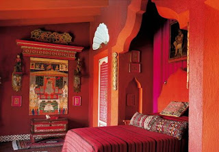
Your DIY Spanish Style Bedroom


OK, you want a DIY Spanish look for your bedroom, you want to give only a handful of dollars, and you want it in a weekend. Here's a simple way to create your bedroom's new look:


You'll Need:

Paint: Primer & a nice, BOLD color
Fabric with an intricate, bold pattern on it
Fabric for drapes (or new drapes)
Objects from Nature
Frames
Spray Paint

~~~~~ the first step ~~~~~

OK, the first thing you can to do transform your bedroom into a Spanish Manor is to remove your furniture and paint the walls a BOLD color. Painting the room is the cheapest way to have a huge effect. A deep and lavish red is nice and dramatic, while an eggshell blue or a spring green all have personality to them, which is what you want. If painting the entire room is too much, consider doing just a wall. If you can't get enough paint, consider doing the ceiling a complimentary color. Also think about the size of your room: darker colors will give it a smaller, cozy feeling while lighter colors will open it up. If you live in a dark area, then lighter (yet still saturated) colors might be the way to go.


~~~~~ the second step ~~~~~


OK, now think about what you want to bring back into your room. Does your furniture match your new look, or is it more of a Victorian or even teenage hue? This is the time to select what you keep, and what you find another home for (your friends, curb, and even your basement/attic will be happy to house what you don't need).

What should you keep? Woods. Natural elements. Things in bold color. Don't bring too much back-- it's nice to live in an open, airy environment, especially if this Spanish Manor is anywhere near the Mediterranean in your imagination.


~~~~~ the third step ~~~~~

Cheap, DIY Wall Art.

Here's where your fabric and frames come in. Purchase some great fabric with strong patterns and colors, or choose a nice white-on-white pattern, and frame it with old frames. You can pick up your frames from garage sales and thrift stores. To create a complete look, remove the glass from the frames and spray paint them a complimentary color to your new walls. When dry, replace the glass, add the fabric, and hang. Instant art, few dollars, big effect.


~~~~~ the fourth step ~~~~~

Drapes. The longer the drapes, the more dramatic the feel, so go straight to the floor. You can either purchase new drapes, or buy some fabric and make your own. Making your own is way cheaper (depending on the fabric), way more DIY, and is the best way to get the perfect length.


~~~~~ the fifth step ~~~~~

Engage your Antique Finding Skillz and look out at garage sales and thrift stores for any accessories that fit your new look. Those could be colorful ceramics, Virgin Mary statues, crosses, and other beautiful items. You don't need too much: a few pieces make a strong statement while several pieces create a crowd.

~~~~~ the sixth step ~~~~~

Lay back and enjoy! And if your friends helped you create your piece di resistance, some tapas & beer is an excellent way to pay them back (just a suggestion).


Want more inspiration?

Spanish Homes Photography

Frida Kahlo

Look up Spanish Style Decor on Google


Do you have any suggestions for creating the perfect DIY Spanish Style room?

Tuesday, May 31, 2011

The Creative Invoice


Why not take something that's ASSUMED boring and bring it to life?


While researching how to create an invoice, I came across Holdsnowater's invoice on Flickr. The design is so great-- it's an invoice within an invoice, it's well labeled, and nothing gets in the way of the theme-- the whole thing screams Invoice, and yet the whole thing screams Well Designed.

It makes me wonder if creatives should have different invoices for different types of work. Like, for me, one Design Invoice, one Photography Invoice, and one Writing Invoice, each one with accompanying visual styles and elements to compliment the theme... Perhaps have a template, and switch the colors and graphics for each one accordingly, but have all other visual elements remain the same.

For a "quick" (not so quick) template that I had to give to my dad for some logo work, I created this one below. It's not as tight and assembled as Hodsnowater's, for sure, and it's not my clear theme delineation proposal, but I like it. Do you?

Do you have any links for other creative twists to boring financial documents?

There's no standard for how to do financial documentation, as long as it's clear. American Apparel, apparently, has a really well designed receipt. Check it out! It's always nice to come across some stellar design.

Friday, May 27, 2011

Art & Sound


Lately I've been taking a good look at art and sound and, for various reasons, have found myself involved in finding sound effects. This latest foray into the world of sound has been looking up bird calls for an app that M & I are creating. And because it's fun when blogs are interactive, here are a few of my favorite birdsong sounds that I've found:

Blackbird:

http://murraycharters.net/rwbb1.wav


Sparrow:

http://rmc.library.cornell.edu/ornithology/sounds/gocspa.wav


And there's nothing like a good ol' BirdLion:

http://simplythebest.net/sounds/WAV/sound_effects_WAV/sound_effect_WAV_files/lion.wav


Image from Strykmig

Monday, May 9, 2011

Burning Man Dome: The Sink


Burning man is hot, sticky, dusty, and dirty. You slather on sunscreen every day, sweat all day, dance all night, and have to deal with porta-potties. Eventually, you really, really, really just want to wash your hands. At least, I do. So much so that last year I took a squirt bottle and filled it with water and alcohol to spray on my palms and fingers to disinfect them. For the longest time I thought that was genius... until it dried my hands out so much that they were cracked and bleeding, and immobile by request (mine and theirs).

Now, oh now, the solution: the 3-Gallon sink. Look at this baby! Toothbrushes, razors, drinking water, face-washing, hand washing. Hootenanny!

Tuesday, May 3, 2011

Comfort at Burning Man

How can you have the best Burning Man crib when you're in a dome and not a camper?

It's essential that you're comfortable at Burning Man. For me, it's essential that I'm comfortable. It's hot, it's new, it's really fun, but it's also extremely physically demanding. There is no place where some self-care doesn't go a long, long way. So I'm thinking about doing a blog series about Burning Man comfort. The series will most definitely be updated, with the "Pimp Your Dome" entry being expanded and lavished with good ideas for months, hopefully. And, hopefully, I'll have some follow-through myself.

Last year, we had our clothes in giant tubs, which was a step up from our duffel bags from the year before, but which led to huge piles of dirty clothes mixed with clean, an inability to find anything, and general swampiness within the bins. The year before, our clothes were strewn around the dome (which was shared between three awesome folks), which was unmanageable. This year, I want something a little different.

Do you have any advice for a kick-ass dome?

- Paige

Friday, April 22, 2011

Public Domain and finding a life on Etsy

I want to live off of my work on Etsy.

I'm going to get a degree in graphic design starting this summer (excited!) and I asked a friend who's known for her intuitiveness what I should do for a career, and she said "follow the energy." That's where I get the energy and it's consistent. I made a very successful (with family and friends) calendar out of bird collages, which I then turned into an art show, and though that was three years ago, I'm still asked about it and asked for a new one. Well, I've finally found that beauty and excitement again with digital collage.

And I see people being really successful at it on Etsy. Check out Piddix on Quit Your Day Job-- erm, I can do that. And I'm going to, starting today. STARTING TODAY. I can't believe I didn't discover this before-- I'm so gung ho, too. This is it. YAY. Especially as one of my best friends deals in antique books and ephemera!!!! And I have a good camera and the ability to check out and scan items. Wow. Can't believe I didn't know about this until now. But I guess everything happens for a reason.

Have you ever had that aha moment yourself?

Thursday, April 21, 2011

Postcard from August


Created for Michelle in an effort to convince her to walk the Wildwood Trail in August instead of July.

~ ~ ~ ~ ~ ~ ~ ~ ~

OK, I have checked my calendar, ma cherie.

My friend Erica is getting married on the 16th, so I definitely can't do it that day.

BUT, oh August, lovely, lovely August. Let me tell you about August:

August is beautiful that time of year.

The trees are out, it's not too hot because we're in the woods, which are always slightly cooler. Everyone's happy and relaxed because it's lovely that time of year. The color palette for August is a deep saffron umber with distinct shades of lily green and egg shell white.

Early August hints with bits of 31st of July, which works well for me-- that transcendence-maya-phase, from one month to the next, both there, both not completely real-- yes, that day works well. The August days of 14, 20, 21 are all splendid, splendid, splendid affairs, offered from the Gods of August to our hiking shoes and feet.

I have a friend who named her son August.

August 15th is the celebration of the last two weeks of summer, the middle of vacation month in the Mediterranean, and it's when all of the soft-serve, homemade ice-cream and hamburger joints have their little windows open at the side of the restaurant, and you can walk up and order a towering vanilla ice-cream and a drink, and sit in the sun and listen to the cicadas. August, oh sweet, sweet August.

I brought you this postcard from August.

It has my vote. I'll always vote for August. And I'll second its running mate, Mrs. July 31st.

Hello Frenchy


Hello Happiness!

Oh, I'm designing up a storm over here at Cake Nana Land. I've finally realized that I can make Etsy bannars and sell them-- because I love to make collage and have always done it well. It's one of those things that I can depend on myself for doing.

Another thing that I would like to do is to get my domain for this blog onto this blog itself. Let this blog wear its proper domain like a fine mink, or silk.

Oh, btw, this is my new cat, Frenchy:


She just came over the day before yesterday and started eating my spaghetti. And it was love at first pasta dish. Of course that meant she was meant to be with me.

- P

Sunday, April 17, 2011

Easter Baskets


This year, a few lovely lady friends and I created an Easter Basket Exchange, where the ladies sent me their addresses and I coordinated basket exchanges, via mail, for all of us. I believe that all of the lovely ladies who responded to my invite with a resounding YES! wanted to re-create that joy in their lives that Easter brings. Correction: that the Easter Basket brings.

My favorite Easter Basket memory is from when I was around five years old. In fact, it's a memory that comes out of a white haze-- just a few seconds of film, really, before returning to the haze that's erased most of my childhood impressions. My mom used to hide our baskets, and we'd have to walk around the house as she shouted, "hot!" or "cold!" depending on how close we were. She'd hide them in closets, under the kitchen sink, and then there was this favorite memory:

I was standing by the glass doors of our living room and looking out into the sweeping backyard to see all of our Easter baskets hanging from the branches of our ancient and gnarly plum tree. It was like a magical dream come true. An old and decrepit tree that sprouted colorful Easter baskets overnight. That memory, that vision, will always be with me.

And so I have tried to recreate it with my friends. Not that I expect anything hanging from a tree, but because I love the Easter magic of it all. Thanks, Mom.

* photo by Jens Meyer